An Easy-To-Follow Guide On How To Make WordPress Accessible

WordPress developers obsess with site optimization. Was it fast enough? Does the layout make sense? Are photographs the proper size and resolution? Is my WordPress accessible? All of this is necessary, yet site accessibility is neglected. Can everyone you want readily reach your site? Do they need help navigating? Do you assist disabled people?
For those unfamiliar, accessibility implies making your site accessible to the most people. It involves making your website accessible to everyone. Millions use WordPress as their CMS, but disabled folks can also utilize it. You must make your WordPress site available to all users. There's a lot to consider, so let's stop with the introduction and straight to the point.
WordPress Accessible Overview
An accessible website is designed and structured for ease of use. This allows them to navigate, interact, and benefit from the website. More people can use an accessible site.
WordPress accessibility has always been important. An utterly accessible website should be utilized by anyone with cognitive, auditory, neurological, physical, or visual challenges.
Web accessibility usually prioritizes disabled persons. Not only should it be accessible to disabled people, but also:
- Change input modes on a small-screen mobile device
- Aged adults with eyesight, mobility, and comprehension issues
- Temporary injury patients
- A site visitor with restricted internet bandwidth
WordPress Accessible: Why You Need?
Web accessibility is becoming increasingly important and urgent as the web's reliability and use grow worldwide. Your site must comply with WCAG and be accessible. Designers, project managers, and marketers should make their sites accessible. Web accessibility will also increase as the web evolves. Meet the needs of each web section and maximize the user experience.
How Accessible Is WordPress By Default?
This question emerges first if you use WordPress to develop sites. It's best to know how accessible your site is and how much work it would take to make it accessible for all users. Luckily, WordPress is easy to use right away. The most popular CMS platform in the world, WordPress has a dedicated accessibility team striving to make it WCAG-compliant. Accessibility improvements come with every WordPress theme.
Thus, the WordPress site's designs, style, and functionality are tested against WordPress accessibility Coding guidelines to ensure accessibility. Others have proved that WordPress is still not accessible to all users despite developments. Many disabled content creators struggle with WordPress. Because all accessible designs and development aspects cannot be automated. WordPress has accessibility issues by default.
WordPress content creation is challenging for disabled people. It's hard to ensure content creators build accessible websites. The WordPress community values accessibility. It's working hard to make its platform accessible to all but still needs to progress to meet its commendable accessibility goals.
Web Content Accessibility Guidelines
The Web Content Accessibility Guidelines (WCAG) explain how to make your site accessible to the most users. But why would you do that? According to the recommendations abstract:
Following these principles will make information accessible to more individuals with impairments, including blindness, low vision, deafness, hearing loss, learning disabilities, cognitive limitations, limited movement, speech disabilities, photosensitivity, and combinations. Following these standards can also improve Web content usability.
That makes sense, isn’t it? If you make your site accessible to disabled users, you expand your reach. The first WCAG was published in May 1999. Version 2.0 was released in December 2008.
It has four main “principles”:
- Users must be able to perceive the site and its content.
- Operable: the site and its navigation must work under various conditions.
- Understandable: site visitors must grasp the site, its navigation, and its content.
- Robust: the site must provide material that numerous user agents, including assistive devices, can read.
These general concepts apply to any website, not just WordPress ones. While we can discuss generic ways to increase a site's accessibility, we will try to make my suggestions WordPress-specific.
Finally, How To Make WordPress Accessible
After you understand WordPress accessibility and its relevance, let's make your WordPress site accessible. WordPress accessibility should be your first focus from the start and remain so.
Consider making your WordPress accessible, like building a safe building for people. It would need a lot of work, and the building's base matters to make it safe and accessible. You cannot guarantee your site's accessibility, but you can try using the finest plugins, themes, and user-friendly content.
1. Opt for an Inclusive Theme

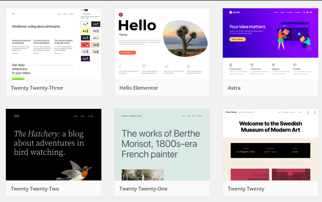
The first option for building a WordPress theme is using a theme from the WordPress directory. The trick is to pick the most accessible website themes. How do you determine if a theme is accessible?
WordPress makes it easy with 92 free, accessible themes in the directory. You can buy paid themes to get the most user-friendly theme for your website. However, researching accessible themes is crucial to ensure a proper, accessible theme. Test your themes for accessibility, not just theme vendors'.
2. Crafting an Accessible Theme from Scratch
- Before building a custom theme, determine your website's accessibility needs. This entails following user-specific recommendations.
- To make your website accessible, build your theme from scratch. A strong HTML base underpins an inclusive website.
- Your website's colors should accommodate everyone, including visually impaired visitors. To make your site accessible, text and background colors must contrast.
- Not everyone uses a mouse to browse websites. Some use only a keyboard. Thus, your site must be developed for keyboard navigation.
- Use ARIA roles and HTML 5 Landmarks to make your website screen-reader-friendly. Screen reader users benefit from these organized layouts.
- Website auto-motion may distract or unnerve users. Allowing users to halt or control automated movements improves the experience.
- Proper HTML semantic markup is essential for clarity. This makes content structure clear and purposeful, making your site easier to read and browse.
3. Incorporate Interactive Elements Thoughtfully
Creating an accessible website requires considering how users will interact with it. You want your site to be easy to use. So let's break it down.
- First, focus on your site's interactive aspects. It could be menus, forms, buttons, or movies. Making these pieces easy to find and use is crucial. Your users should be able to navigate and interact easily with your site.
- This involves navigation menus. Keyboard controls should work on these menus from header to footer. Disability-related keyboard navigation users need this.
- Navigation consistency is essential. Users should easily navigate your site. All navigation should be straightforward and consistent.
- Provide visible controls for GIFs, sliders, and videos that start instantly on your website. Users can pause and stop animations and sounds with these controls. This lets them tailor their site experience, which improves accessibility.
- Finally, breadcrumbs and clear headings are often helpful. These tiny details can improve website usability. They assist users in navigating your site. Creating an inclusive and seamless online experience for all visitors is key.
4. Utilize WordPress Plugins for Accessibility

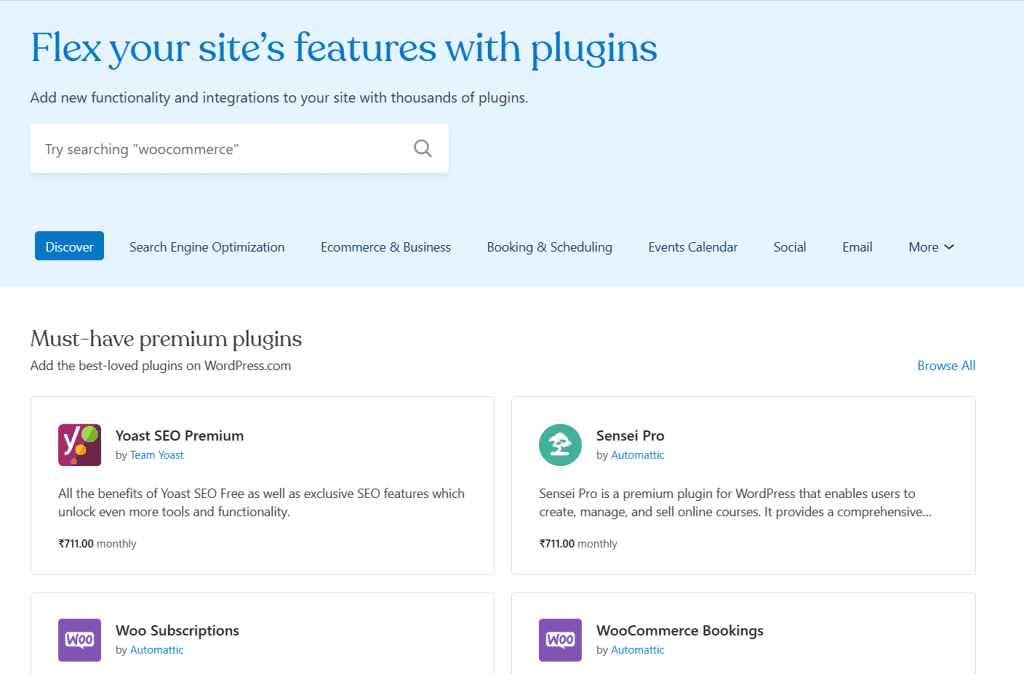
WordPress plugins are helpful tools that improve WordPress website functioning—two types of plugins aid accessibility. The first type involves developing a new accessible site from scratch. The second type improves site accessibility.
These plugins are helpful, but you can't make your site 100% accessible with one click. They're tools for you to improve accessibility. Avoid plugins that promise "one-click accessibility" or "automatically accessible."
These accessibility plugins are outstanding. They aid you in several ways. First, they can check your site for accessibility issues. This is like a complete checkup to identify areas for improvement. They then offer solutions and frontend tools to fix these difficulties, making your users' experience more accessible.
These plugins are your accessibility partners. They'll help you identify areas for improvement and provide the tools. These plugins help make your WordPress site more accessible.
5. Develop an Inclusive Design
WordPress website accessibility depends on design as well as themes and plugins. Design is essential to making your site accessible to all. Let's examine accessible design basics.
a. Enhance Image Accessibility
Images are crucial to accessible website design. They provide visual appeal and enhance your site's storytelling and engagement. However, you must realize that not all website users will view these photographs similarly. Screen readers and other assistive devices may help some navigate the internet. Web design requires making images available to all visitors, regardless of ability.
You supply a brief description of each website image as alt text. This is like painting a picture verbally for those who can't see. The alt text of an image is read aloud by a screen reader to ensure that everyone can understand the content.
Why Alt Text Matters:
- Alt text promotes diversity. By giving helpful image descriptions, you expand your website's viewership. You encourage visually impaired people, text-based browser users, and search engines to use your content.
- Alt text bridges context and cognitive gaps. All your visitors can comprehend the photos' context and relevance. If your website contains a photo of a peaceful beach at sunset, the alt text can evoke the same sentiments for those who can't see it.
- In addition to accessibility, alt text has SEO benefits. Alt text helps search engines like Google analyze and index photos, improving your website's rankings.
b. Ensure Sufficient Color and Contrast
- In an accessible WordPress site, colors and contrast are crucial to making the user interface accessible to everyone, including people with poor eyesight, color blindness, or specific devices.
- Weak color and contrast can hurt your website's usability and accessibility. Color and contrast can make a big difference for users with visual impairments, color blindness, or different screen sizes.
- To improve accessibility, your website's photos, text, and other elements must have adequate contrast. The foreground (text or image) and background should be distinct. When contrast is sufficient, your information is easier to read, understand, and interact with.
- To make your site more accessible, use contrast-checking tools. These tools let you choose complementary colors and meet accessibility standards for contrast. Such tools let you tweak your color choices and make your site more accessible
c. Prioritize Text Accessibility
- Digital life relies on text. The text tells your website's story, whether it's a blog post, a website snippet, or a story. Creating an inclusive online space requires making this textual narrative available to all visitors, regardless of how they interact with it.
- An accessible font is legible at any size. Consider it the cornerstone of your website's readability. Easy-to-read fonts ensure that a varied audience may understand your information. Arial, Verdana, Calibri, Tahoma, and Rockwell are great for this. These fonts are simple and make sure readers understand ornate or cursive styles.
- Now, text size. Font size affects accessibility as well as aesthetics. Web Content Accessibility Guidelines (WCAG) propose 9pt or 12px text. These sizes make the text legible for everyone. Additionally, text must be legible at 200% zoom. This is essential for folks who need to magnify text to engage with your material.
- Another consideration is text weight. By "weight," we indicate character thickness. Choose bolder or larger text for accessibility. This improves clarity and lets readers read without squinting, especially those with visual impairments.
Conclusion
Making your WordPress site accessible may seem daunting, but the rewards are many. First, you're doing the right thing by making your work accessible to the most people. Second, your SEO will improve, increasing site visitors.
Those variables together increase site success. The Web Content Accessibility Guidelines may seem intimidating initially, but this should help you get started and cross some of those changes off your list.


